Thursday, 28 January 2016
Skyfall title sequence analysis (spy genre)
The James Bond Skyfall film comes under the genre our group picked for our title sequence. The genre is spy, which in turn is a sub-genre of action.
The sequence combines elements of mystery and perhaps even illusion with key iconography from the genre itself. This iconography includes guns, women and silhouettes. These visual elements are very iconic of this genre as audiences have got used to seeing them in similar films over the years. These elements are also very common in the James Bond films and feature regularly in each film in the franchise.
This sequence is perhaps one of the more unique title sequences from the spy genre as, as previously mentioned, it uses imagery that could perhaps connote mystery. Strange shapes and a slightly vague narrative leaves the audience wanting to see more of the film. However, again the iconography is key for allowing the audience an insight into the theme and genre of the film even if they had never seen a James Bond film before. The sequence also uses a shot of inside a gun barrel which again has become a key visual element of the Bond franchise. The silhouettes used are also important as they yet again give off a sense of mystery which the audience can use to create enigmas towards who the main character is. This keeps the audience in touch and makes them want to see more to find out.
The sequence arguably shows the danger that the protagonist (James Bond) will face throughout the film as a whole. The imagery that looks to closely resemble hell and images such as skulls, blood or guns could form this so called "danger". This danger is another key convention of spy films as the main character usually plays a hero who has to fight against all odds to complete some sort of mission/objective.
The titles themselves take on a slightly less important role. They adopt a smaller font size and simple font choice in order to not take too much attention away from the imagery on screen behind the titles. The only titles that are arguably made to look important are the main characters names and the film name itself alongside the director and production company.

Monday, 25 January 2016
Genre title sequence analysis
Mission Impossible 4:
This sequence is very fast paced and takes on the perspective of a fuse. The audience are put in a position where they are almost following the fuse and it takes them through a lot of key scenes from the film itself. The fuse itself is key iconography as it connotes explosions and danger or violence. These elements are all extremely common in spy and action films.
During the sequence there is also a car chase. Again this is typical of an action/spy film and is key iconography which is used effectively as the audience instantly recognises this and associates the film with the genre. This also helps them to know the sort of theme that the film will follow and what the action will be like throughout the film.
All of this is accompanied by a very generic soundtrack which has also become extremely recognisable with this genre. It is very dramatic which suits the fast pace.
This film is also a spy film which fits into the genre my group chose for our title sequence. The sequence shows off some of the key iconography and codes and conventions of this genre.
Napoleon Dynamite:
This title sequence is effective at portraying the genre of the film which is comedy. An abnormal soundtrack accompanied by simple images helps to clearly portray this to the audience. The titles themselves sometimes are formed by parts of these images which help to create a light hearted comedic effect.
The film is clearly targeting more children or young adults. This is shown by the setting which is an American High School. The setting becomes clear by all the books and the lunch. Also, one of the titles which appears almost like a license, clearly says "Preston High".
The simple images and text could perhaps be key iconography for this film as it takes ordinary and perhaps even dull objects in order to portray the titles. This once again creates a light hearted atmosphere and a much less serious mood about the film, showing how the genre is undisputedly comedy.
Children of men:
The Children of men title sequence portrays us a dystopian society. It is clearly set in the future and looks unerringly bleak. Disturbing images from different perspectives are used to portray the genre, which in turn is a hybrid of dystopian and sci-fi.
The sequence as a whole is a montage of clips showing what is happening in the dystopia from what seems to be a range of different perspectives. This sets up the context of why the world has become this dystopia which allows the audience to slightly understand the story better. The sequence also features some newspaper clippings and a report from the news on a TV. This gives further evidence to the audience about what is happening in the world of the film.
The sequence also includes some key iconography which is quite easily associated with a dystopia. These elements include fires, vandalism, violence and police as it seems that anarchy has occurred in the world within the film. These elements have a significant impact on the sequence as it is very hard hitting. In other words it seems almost realistic as if it could really happen in the future in reality. The soundtrack is very abrupt and serious which suits the sequence well considering the genre and all the key elements previously mentioned.
The fonts on the titles themselves are very bland in colour and are very straight and to the point. Again this is useful at conveying the genre as it is very serious. The footage and soundtrack that accompanies the text supports this idea and shows how it is deliberately used in this way.
This sequence is very fast paced and takes on the perspective of a fuse. The audience are put in a position where they are almost following the fuse and it takes them through a lot of key scenes from the film itself. The fuse itself is key iconography as it connotes explosions and danger or violence. These elements are all extremely common in spy and action films.
During the sequence there is also a car chase. Again this is typical of an action/spy film and is key iconography which is used effectively as the audience instantly recognises this and associates the film with the genre. This also helps them to know the sort of theme that the film will follow and what the action will be like throughout the film.
All of this is accompanied by a very generic soundtrack which has also become extremely recognisable with this genre. It is very dramatic which suits the fast pace.
This film is also a spy film which fits into the genre my group chose for our title sequence. The sequence shows off some of the key iconography and codes and conventions of this genre.
Napoleon Dynamite:
This title sequence is effective at portraying the genre of the film which is comedy. An abnormal soundtrack accompanied by simple images helps to clearly portray this to the audience. The titles themselves sometimes are formed by parts of these images which help to create a light hearted comedic effect.
The film is clearly targeting more children or young adults. This is shown by the setting which is an American High School. The setting becomes clear by all the books and the lunch. Also, one of the titles which appears almost like a license, clearly says "Preston High".
The simple images and text could perhaps be key iconography for this film as it takes ordinary and perhaps even dull objects in order to portray the titles. This once again creates a light hearted atmosphere and a much less serious mood about the film, showing how the genre is undisputedly comedy.
Children of men:
The Children of men title sequence portrays us a dystopian society. It is clearly set in the future and looks unerringly bleak. Disturbing images from different perspectives are used to portray the genre, which in turn is a hybrid of dystopian and sci-fi.
The sequence as a whole is a montage of clips showing what is happening in the dystopia from what seems to be a range of different perspectives. This sets up the context of why the world has become this dystopia which allows the audience to slightly understand the story better. The sequence also features some newspaper clippings and a report from the news on a TV. This gives further evidence to the audience about what is happening in the world of the film.
The sequence also includes some key iconography which is quite easily associated with a dystopia. These elements include fires, vandalism, violence and police as it seems that anarchy has occurred in the world within the film. These elements have a significant impact on the sequence as it is very hard hitting. In other words it seems almost realistic as if it could really happen in the future in reality. The soundtrack is very abrupt and serious which suits the sequence well considering the genre and all the key elements previously mentioned.
The fonts on the titles themselves are very bland in colour and are very straight and to the point. Again this is useful at conveying the genre as it is very serious. The footage and soundtrack that accompanies the text supports this idea and shows how it is deliberately used in this way.
Class Notes- Tuesday 19th January
Genre
N.I.C.S- Use to define genre
N- Narrative
I- Iconography (Visual elements which establish the genre)
C- Characters
S- Setting
Analysing genre:
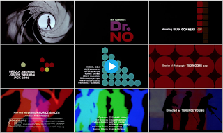
Dr.No
Action/spy film- silhouettes, gun barrel (iconography which establishes the genre). Features Sean Connery-most known for James Bond.
Splice
Sci-fi film, green colour scheme, consistent colour scheme throughout which gives off a skin/ alien effect on the audience.

The back up plan
Chick flick- bright colours. Hybrid: Romantic-Comedy (Rom-Com). Romance iconography- babies on TV. Comedy iconography- Flasher. This film is clearly targeted towards a female audience- elegant typography, animation, colour scheme.

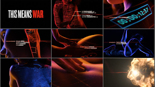
This means war
Rom-Com: references spy film. Uses intertextuality to reference a James Bond film.
N.I.C.S- Use to define genre
N- Narrative
I- Iconography (Visual elements which establish the genre)
C- Characters
S- Setting
Analysing genre:
Dr.No
Action/spy film- silhouettes, gun barrel (iconography which establishes the genre). Features Sean Connery-most known for James Bond.

Splice
Sci-fi film, green colour scheme, consistent colour scheme throughout which gives off a skin/ alien effect on the audience.

The back up plan
Chick flick- bright colours. Hybrid: Romantic-Comedy (Rom-Com). Romance iconography- babies on TV. Comedy iconography- Flasher. This film is clearly targeted towards a female audience- elegant typography, animation, colour scheme.

This means war
Rom-Com: references spy film. Uses intertextuality to reference a James Bond film.

Wednesday, 20 January 2016
Saul Bass- 1960 Psycho title sequence analysis
Saul Bass's title sequence for the original Psycho movie (1960, Alfred Hitchcock) is a good example of the style that he adopted for the majority of his career. The use of straight lines and simple text, accompanied by a dramatic soundtrack encapsulated the genre of the film perfectly.
The genre is horror and the sinister sounding soundtrack conveys this well. The text itself is very simple, something an audience is used to seeing of Saul Bass. The straight lines are used to almost separate each block of text as it appears to almost "push" the text off the screen before disappearing to allow more text to enter the screen. These lines can also be seen to form some of the text itself throughout the sequence. The titles adopt a san-serif style font.
It is also interesting to note how the lines don't all come from the same part of the screen as they appear onto the screen from all angles. It could be argued that the lines are extremely fitting for a horror film as there is no room for flexibility or perhaps even escape. This suits the genre well and perhaps gives the audience an insight into what will happen later on in the film.
The soundtrack is extremely off putting and disturbing which is very effective given the genre of the film. It also suits the way the sequence is designed with all the straight lines as the notes sound very sharp and abrupt, almost like the lines themselves.
Tuesday, 19 January 2016
Class notes- Thursday 14th January
Saul Bass (1920-1996)
Who was he?
He started his career by designing posters with his ability of being able to capture the mood of a film by using simple images and shapes.
Often, these shapes used were hand drawn by Bass in order to create a more casual appearance. This was also usually accompanied by a sophisticated soundtrack.
Throughout his career he designed over 60 title sequences with his most famous including North by Northwest, Vertigo and Psycho.
He worked alongside Alfred Hitchcock a lot in his career with a good example being Vertigo.
His title sequences revolutionised the style in which we see them these days.

Who was he?
- An American graphic designer who became famous for his work in film.
- He studied design at Art Students League in Manhattan.
- Born in New York on May 8th 1920.
He started his career by designing posters with his ability of being able to capture the mood of a film by using simple images and shapes.
Often, these shapes used were hand drawn by Bass in order to create a more casual appearance. This was also usually accompanied by a sophisticated soundtrack.
Throughout his career he designed over 60 title sequences with his most famous including North by Northwest, Vertigo and Psycho.
He worked alongside Alfred Hitchcock a lot in his career with a good example being Vertigo.
His title sequences revolutionised the style in which we see them these days.
Subscribe to:
Posts (Atom)