Monday, 4 April 2016

Evaluation part 8- What do you feel you have learnt in the progression to your full product?

Overall I feel there were several aspects about our final product that were successful. I feel the cinematography was successful as we managed to achieve our aim of making the sequence look conventional but also incorporating different camera shots and angles to make it more visually entertaining. All of the shots were also quite clear and there were no blurry ones. I also feel the editing was successful as it upheld a sense of continuity throughout whilst also using different transitions and techniques to keep the audience enthralled. I also feel that the time-lapse idea was very original as not many others thought of it.
However, I feel like the least successful aspect to our final sequence was a slight lack in research into other title sequences in our genre. We were actually limited to an extent on the amount of sequences we could research and analyse as there aren't many big budget and conventional spy films outside of the James Bond and Bourne franchises. We instead decided to mix the two together in order to come up with our own concept, however we lacked the certain knowledge of what spy film title sequences really looked like. Perhaps some research into older James Bond films and perhaps some more action films would have aided us in the creation of our sequence and most certainly the codes and conventions we should incorporate in our own. We also for a while struggled with the typography and soundtrack, as we were indecisive over what would suit our sequence.


In order to improve on these areas we relentlessly researched typography and soundtracks whilst also experimenting with them in our own sequence to see whether they suited or not. Eventually we found a font and soundtrack we liked and our teachers agreed that they suited the genre as a whole better and made the sequence more conventional.

Evaluation part 7- What have you learnt about technologies in the process?

Throughout the creation of our sequence we used many different methods in terms of capturing out footage and compiling and editing it all together. Firstly, we used the Go-Pro to capture some of the investigation wall shots. This was the first time any of us had used one so it was a good way of experimenting with different ways of filming. We used the head strap as a way of holding the Go-Pro as well as a Steady-cam and a tripod. However, we eventually decided to scrap the shots from the Go-Pro as we felt it gave a shaky effect that we didn't want in our sequence.


I also felt I learnt a bit about how to use the cameras supplied to us by the media department. Although I didn't actually do any of the cinematography I felt I learnt how to use the tripod to good effect and how to film from different shots and angles. Throughout our sequence we assigned roles to everyone in the group, although we were still free to help out each other regardless. Ghanshaym and Adam were our main cinematographers whilst Ghanshyam also was our main editor with myself as an assistant. Again I felt I learnt a lot from watching Ghanshyam and experimenting with different techniques such as filters, transitions and text. We felt the technical roles we assigned were suitable as Ghanshyam has had previous experience with both editing and using cameras and Adam also had experience with using the cameras to film.

Evaluation part 6- How did you attract and address your target audience?


Evaluation part 5- How does your media product represent particular social groups?

Evaluation part 4- In what ways does your media product use, develop or challenge forms and conventions of real media products?

Our title sequence has aimed to use the typical codes and conventions of the spy sub-genre in order to be instantly recognisable and clear when audiences watch it. We attempted to achieve this by using conventional locations, sound, costumes and props.

The props used were picked because of their conventional value. We created a number of our own props such as the investigation wall and newspaper articles. We thought the wall was an extremely useful prop as it was very conventional of the genre. As a group we all put our ideas for conventional props together and it was predominantly my role to make the final choice of the props used, although the others still had input.


The soundtrack used was a very action like piece of music. Myself and Ghanshyam from our group were predominantly involved in the choice and research of this soundtrack and eventually we found one on YouTube, which was copyright free (as mentioned in the spec). We ultimately decided on this soundtrack as we felt it was suitable for our piece in terms of structure and the way it progressed and flowed. We also felt it suited the genre and conformed to the conventions our chosen genre. However, we did originally pick a different soundtrack. However our class feedback suggested it made our piece seem like a comedy and didn't suit the genre well. Therefore we decided to research more into a new soundtrack and this ultimately led us to the one we chose.

The setting of the majority of our shots were London. We chose London because of its heritage and iconic landmarks such as Big Ben and the Houses of Parliament. It is also where the MI6 building is situated and this is where the main narrative of our film revolves around.


The typography used we felt was conventional. We picked the "neuropol" font as we felt it looked very conventional and much like a typical spy film. Our initial research of fonts came up with a few results:
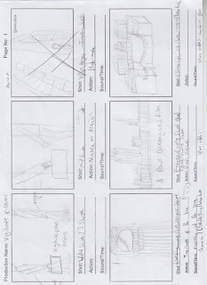


However, we felt that the Neuropol font was the best and most conventional of them all. Our teachers also felt this and a lot of our feedback from the class also reflected the view that the first font on our rough edit wasn't conventional and didn't suit the genre as a whole. 

Evaluation part 3- What kind of media institution would distribute your media product and why?


Evaluation part 2- Who would be the target audience and why?

Evaluation part 1- Brief

The brief that I had to follow (as part of a group or on my own) was to create a title sequence of film from a genre of our choice. I chose to work in a group which consisted of Ghanshyam, Thomas and Adam. We had to use our own footage and non-copyright sound including soundtracks and sound effects. We had to film and edit the whole sequence on our own from scratch. Our sequence took on quite a conventional style as our genre was spy. We felt that this was a very conventional genre and as a result of this we used quite iconic scenery of London and conventions of a spy film to create our sequence. The spy genre is in fact a sub-genre of the action genre. The conventions can be seen in almost all spy films including gun fights, action scene, explosions, love interests and chase scenes. We tried to incorporate some of these conventions in our sequence and this can be seen by the gun in the desk scene, the chase scene right at the end (which is the beginning of our opening scene) and the character that Daisy Ridley plays.

Sunday, 20 March 2016

Agent X final edit

Journal entry 15

Today during our lesson we began to finalise the edit by adding filters and fixing any small issues. We showed one of our teachers our edit and she told us to add filters to some shots in order to make them easier to distinguish between from other shots. For example, the shot of Ghanshyam tearing the wall down was too bright and seemed like just a normal shot. To amend this we added a filter in to make it look slightly more grey. This allowed us to know when the shot has changed. We also added a filter onto the desk scene to make it look darker so it was a little more realistic seeing as the shot was meant to be inside. These were the minor changes that we felt were needed in order to finalise the whole sequence, ready for it to be shown on Tuesday during our lesson. Our teacher wanted us to re-film the desk shots, however after we told her how the previous ones had gone wrong she agreed that it would be fine to then just put a filter on it.

Production log

Whilst were filming our title sequence we needed a way to organise ourselves and the dates of filming. To do this we filled out a production log with all the dates, times, locations and equipment needed.

We filled this out whenever we were going filming and made sure that we all stuck to the dates and times when we were needed.

Thursday, 17 March 2016

Journal entry 14

Today after school myself and Ghanshyam stayed behind to finish the editing of our sequence. As the editor, Ghanshyam carried out the editing process whilst I gave him support whilst also working on my blog and research from other films in our genre. We managed to get the main issues solved concerning the editing and are now currently in the process of fixing minor issues like sound effects and the length of certain shots. By making minor changes to the length of some shots we feel we have made progress and are now almost ready to present our final cut to the class.

Journal entry 13

Today 3 members of our group (Me, Adam and Thomas) re-filmed the desk scene shots. However, as we were looking over it we felt the shots weren't good enough. Our cinematographer (Adam) didn't keep the camera steady enough. This wasn't stable and therefore needed to be stabilised through Final Cut if we decided to use them. The lighting wasn't as good as we hoped either. Because of this we decided we aren't going to use these shots and will either edit the current ones differently or re-film them in our next available lesson/ after school.

This is a picture of our set up which we used to shoot the desk scenes today. However, as stated already, we feel the shots weren't good enough so we decided to scrap them.

Tuesday, 15 March 2016

Journal entry 12

Today our group went up to Bexleyheath during out 2 hour media lesson to film the rest of our opening chase scene. We filmed the first 2 shots of this scene whilst we were up London but we then had to leave because of timing issues. We deliberately shot the first 2 shots so it would lead Agent X down a staircase into a car park as we already had the Bexleyheath ASDA car park in mind originally. We could then go to Bexleyheath during our lesson in order to complete the scene. Now all we have to re-film is the desk scene which we will look to film in our 2 hour media lesson on Thursday. Then we will edit it together and hopefully have the whole sequence finished by the end of this week. The filming itself went well. There were no distractions and the location itself wasn't that busy. It was a bit noisy, however that didn't matter as the majority of the scene is going to be soundtrack only.

Sunday, 13 March 2016

Journal entry 11

Today all four of us in our group travelled up to London to re film the shots that were suggested to us when we showed our class our first edit. These shots included the briefcase exchange, time-lapse and the tilting shot of the mi6 building. We also added in a shot of the Houses of Parliament and the British flag on the top. We felt the flag was very iconic as it is a British film.


For the time-lapse shot we had to film it in a different location to the one we filmed the first one. This was because there was some sort of event at Trafalgar Square which was our first location. Instead, we filmed opposite the Houses of Parliament. Our feedback for this shot was that it was hard to notice me when I walked past the camera with the briefcase. One suggestion was that we should slow down the time-lapse in order to show me walking past the camera. We made sure when I walked past the camera it was relatively clear. The shot was also considerably lighter than the first time we shot it. We also added a completely  new shot which we came up with whilst we were in London. We filmed a shot of Agent X (me) walking along the walkway next to the River Thames from a high angle.


We also began filming our opening scene which was suggested to us by our teachers as our first edit was quite short. Our opening scene was a chase scene. We shot the first two shots of this scene, with Agent X spotting Morgan Freeman (villain) and turning to run. We then filmed Morgan Freeman chasing Agent X down a stairway leading to a car park. We will continue filming of this shot as soon as possible. For this shot we stuck to the characters we had assigned each other for the whole sequence. Therefore, I played the protagonist Agent X and Ghanshyam played the villain which is played by Morgan Freeman.


Here are some pictures of our filming session. Our cinematographers for the day were Ghanshyam and Adam. They both took turns with the camera and both contributed to the filming of all our shots.

Friday, 11 March 2016

Typography questionnaire


Our group decided to propose a questionnaire to some of our classmates over the choice of typography for our title sequence. As you can see, the majority voted for the Neuropol font which we actually used for the sequence. We felt that this was the most conventional font of the options and were glad with the outcome of the questionnaire as the majority of our class mates agreed.

Thursday, 10 March 2016

First edit feedback

Here are the feedback sheets which our class and teachers filled out for our group. We have taken the feedback on board and will begin to re-film any shots suggested and add any others that have been requested.


Journal entry 10

Today in class we all decided on a new soundtrack for our sequence.


We showed one of our teachers and she agreed that it was an improvement on the original soundtrack we had as it had more momentum behind it and more of a beat and melody. Now we will have to make sure all the text is in sync with the soundtrack and that the shots are too. Our editor, Ghanshyam, has edited it so it appropriately suits the flow of the sequence at the start and when the title appears.

First Edit- Agent X title sequence


This is our first edit for our title sequence. Ghanshyam from our group uploaded it to his YouTube channel for us all to have access to it as he was in charge of the editing process of the sequence. We still need to change the text and the soundtrack of this version and there are still shots to be refilmed and additional ones to be included.

Wednesday, 9 March 2016

Journal entry 9

Today we showed our first edit to our class and teachers. There were a number of improvements suggested by our peers and teachers which we will take into consideration. Firstly, the soundtrack was a common problem. Many people shared the same thoughts as us where it doesn't really fit the sequence. One of our teachers also suggested that it never really picks up pace wise and therefore doesn't match the pace of our sequence as a whole. We will look into different soundtrack options and how they fit the sequence in the next few days and hopefully find a new one by the end of the week.


Another issue that was raised is the font of our titles. Many people agreed that the font of the film name doesn't suit the genre. To fix this issue we will go back into researching different fonts and experiment with them in our piece.


A few of our classmates also said it was quite difficult to distinguish the main character in some of our shots. This was particularly clear in the timelapse shot in Trafalgar Square. Agent X is supposed to walk in front of the camera with the briefcase before the timelapse starts. However, most people didn't actually realise it was Agent X who walked past the screen and suggested that we could maybe draw more attention to him. One way to do this that was suggested was to slow down the time-lapse as Agent X walks past, then speed it up again.


One of our teachers also said the table scene could do with improving. She said it felt like the table was empty and there weren't enough props on the table. We will have to come back to this shot and recreate the shot exactly how it was with the added props.


We have also been asked to create the first scene of the film itself as our sequence is quite short.

Monday, 7 March 2016

Journal post 8

The soundtrack for our piece was chosen off of the copyright free music website linked on the Welling Media and Film blog. We were reasonably happy with the soundtrack at first as we felt it suited the genre in particular. However, through the editing process we started to notice how it didn't completely fit the flow of the sequence. It was difficult to find a soundtrack that already existed that was copyright free and fitted the sequence seamlessly. The only real alternative to finding a soundtrack which completely suited the flow of the sequence was to make our own, but we all decided we couldn't do this as we didn't feel confident enough in our ability to do this. After we have shown our first edit to our class we will take on board the feedback and look to solve any issues raised whilst also looking for another possible few options for soundtracks.

Journal entry 7

For the past 2 weeks during our media lessons our group has been creating and editing our first edit of our title sequence. Our main editor has been Ghanshyam whilst myself, Thomas and Adam have been giving our advice and thoughts on how the sequence should be edited. We have also been working on our blogs and researching different fonts for the text that appears in the sequence. This is something I in particular have attempted to focus on and so far we have a possible 6 fonts which we could use for the text. Ghanshyam's role as the main editor means he has been in charge of putting all of our footage together, applying filters, cuts and transitions and adding text in. As already mentioned, we have all had a say in how the sequence has been put together and have helped Ghanshyam with the editing. On Tuesday during our double media lesson we will show our first edit to the rest of our class and receive feedback from them over what went well and what could be improved.

Thursday, 3 March 2016

Journal entry 6

Today our group finished off our first edit of our sequence. We finished off the text and titles and now only have a few shots which we will need to re film. We may also reconsider the soundtrack and whether or not it suits the pace and flow of the sequence. We finished off by exporting the sequence from final cut pro onto Ghanshyam's USB to present to the rest of our class during tomorrow's lesson.The main shot we will need to redo is the exchange shot with the briefcase. Originally we had filmed the briefcase exchange shot right in front of the mi6 building. However, we felt the lighting wasn't good enough and the fact that we couldn't get a good shot of the mi6 building itself spurred us on to film the shot on the other side of the River Thames. Myself and Ghanshyam were the two actors in the shot. The main problem with the shot was the camera was tilted because one of the tripod legs was wonky. This meant that the whole shot was off centred and therefore needed to be redone. Also, Ghanshyam had already played Morgan Freeman in the sequence. This shot required him to play Michael Caine. Therefore it didn't make much sense. When we come to redoing it we will have either Thomas or Adam in our group playing Michael Caine alongside me in this shot.


Tuesday, 1 March 2016

Journal entry 5

Today we started looking at different fonts and ways to position the text in our sequence itself. We have a few ideas of fonts as shown below:

We will continue to look for other fonts but have decided that "xperia" and "breamcatcher" are the best fonts for the film title itself but not the other titles such as actors and the director.

Friday, 26 February 2016

Journal entry 4

Today our group put together a rough edit of all the footage we have filmed so far. It was a reasonable success with everyone that watched it. However, we did notice that a few of the shots were a bit slanted because of a slightly broken tripod. Because of this our group will have to go back up to London next Saturday in order to capture the few shots that had this problem. Only a few shots will have to be redone and these include; the briefcase exchange shot and the Big Ben and Houses of Parliament shot. We will also have to choose a filming day which has similar good weather to the original filming day in order to keep the lighting consistent throughout the whole piece.

Monday, 22 February 2016

Agent X film pitch


Class research


Here you can see a few of our spider diagrams we produced when we were researching different genres. You can then see in the second picture our spider diagram when we settled on the spy genre.

Audience profile


This is our audience profile for our film 'Agent X'. As you can see the main target audience is white, British males from 18-29. We felt this was an appropriate target audience as we felt the genre brings a lot of excitement and action, which a lot of younger people are interested in. Therefore this will be the main group of people who go to the cinema and watch our film. If we target this demographic and use a lot of marketing techniques which would appeal to them then they will be more likely to see our film and we will therefore generate more revenue.

Wednesday, 17 February 2016

Location shots


Here are some of our location shots which we took over 2 days of being up London. These are some of the key locations that we filmed our shots at.


Tuesday, 16 February 2016

Journal entry 3

Today 3 members of our group (me, Ghanshyam and Thomas) went up to London to film our establishing shots of the landmarks. The shooting went well, the weather was perfect and so was the lighting. We managed to film the majority of the shots on our storyboard with relative ease. Some of the shots came out blurry but we made sure that we filmed each shot at least 2/3 times.
 There was one issue with the Houses of Parliament show however. We didn't know beforehand that there was construction work on the Houses of Parliament. This meant that we couldn't get the shot we wanted to get originally and meant we had to improvise and change the shot when we got there. We weren't able to find out when this construction was due to be finished so we will have to go back at a later date and re-film the shot regardless. We managed to film in all the locations we wanted to including; the Houses of Parliament, Mi6 building and the River Thames. We also filmed our time lapse shot in Trafalgar Square with relative ease.

Tuesday, 9 February 2016

Journal entry 2

On the 16th of February in half term our group has planned to go up to London in order to take pictures of our locations and start filming for our title sequence. We will film our establishing shots which open our sequence. The locations we will go to in order to film these are: Vauxhall Bridge (MI6 building), Houses of Parliament, Big Ben and the London Eye. There may be other places where we decide to get a shot of during the time we are there but the places stated are locations we will almost definitely visit.

Monday, 8 February 2016

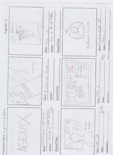
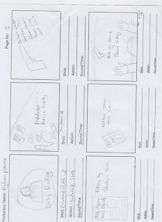
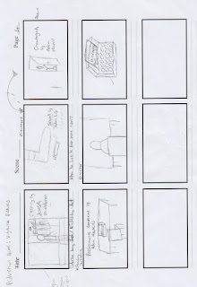
Storyboards for title sequence


These storyboards won't be our final completed sequence. There will be shots added in and shots taken out as we go along the production process. However, the basic shots and most important shots are there on the storyboard for us to look at whilst filming.


Saturday, 6 February 2016

Journal entry 1

Today we started creating and printing off props for our title sequence. A couple of our shots require newspaper clippings and articles. Because of this, one member of our group created some using Photoshop. Here is an example of these newspaper articles:


We also wanted to create an investigation wall for one of our shots. To do this we had to print off lots of different pictures off the internet of key characters and locations. We then got the permission of one our teachers to use one of their classroom walls to create this for our shot.


This is how the wall looked after we created it. We still had to remove the blue borders around the edge of the wall but other than that this is how it would like as the final product. When it came to actually shooting this scene we turned all the lights off and set up a studio light just off shot. We also experimented with shooting the scene with a Go Pro and a steady cam to see what gave us the best results.

Wednesday, 3 February 2016

Soundtrack options for title sequence

Soundtrack 1:

Soundtrack 2:


Soundtrack 3:
https://audionetwork.lgfl.org.uk/production-music/all-to-play-for_28071.aspx

Our group has chosen soundtrack 3 as we feel it suits the pace and genre of our film. The buildup comes at an appropriate time which suits our sequence well.

Tuesday, 2 February 2016

Title sequence idea

As a group we have come up with a clear idea an concept for our title sequence. We have created the whole narrative for our film "Agent X" and have casted the main characters in a way we feel will suit the film and the genre.

Our sequence will combine a use of longer establishing shots of key iconography and British landmarks with fast paced and shorter shots. These shorter shots take inspiration from Se7en and will accompanied by an increase in pace of the soundtrack.

The sequence won't regularly show our main characters faces. We only see the characters faces once, Agent X on the wanted poster, Michael Caine and Daisy Ridley on the investigation wall and Morgan Freeman will be seen to be looking at the wall. However we won't see Morgan Freeman's face throughout.

The sequence will begin with a wide angle shot of our protagonist (Agent X, Josh Bowman) and his helper (Michael Caine). The sequence will then go on to show off the landmarks around London, showcasing the British side of the film and reinforcing the genre and conventions of this genre. The pace significantly increases once the title of the film itself appears. From then on, the cuts are quicker and more frequent as the suspense continues to build.

From this point the sequence will take on two different perspectives: from the protagonist Agent X and from the antagonist Morgan Freeman (character name still to be decided.) This will give the audience a slight insight into the narrative of the film and hopefully be able to increase the suspense even further.

Monday, 1 February 2016

Spy Genre- codes and conventions

The codes and conventions for our chosen genre for our title sequence could also be linked to action movies. This is because the spy genre is actually a sub-genre of the action genre and our title sequence is of a film which combines the two. The codes and conventions are:


  • Gun fights
  • Explosions 
  • High speed chases 
  • Heroes and villains 
  • Sidekicks
  • Women 
  • Excitement, suspense and tension
  • Rescue missions 
  • Military themes
  • Love interests
  • Relationships
These are the key elements which apply to most spy films and will feature predominantly in the films. The James Bond franchise will show the majority of these because it is undoubtedly the most conventional spy film in the genre. Therefore it looks to use as many of these elements as possible in order to convey the genre effectively.       

Thursday, 28 January 2016

Skyfall title sequence analysis (spy genre)


The James Bond Skyfall film comes under the genre our group picked for our title sequence. The genre is spy, which in turn is a sub-genre of action.

The sequence combines elements of mystery and perhaps even illusion with key iconography from the genre itself. This iconography includes guns, women and silhouettes. These visual elements are very iconic of this genre as audiences have got used to seeing them in similar films over the years. These elements are also very common in the James Bond films and feature regularly in each film in the franchise.

This sequence is perhaps one of the more unique title sequences from the spy genre as, as previously mentioned, it uses imagery that could perhaps connote mystery. Strange shapes and a slightly vague narrative leaves the audience wanting to see more of the film. However, again the iconography is key for allowing the audience an insight into the theme and genre of the film even if they had never seen a James Bond film before. The sequence also uses a shot of inside a gun barrel which again has become a key visual element of the Bond franchise. The silhouettes used are also important as they yet again give off a sense of mystery which the audience can use to create enigmas towards who the main character is. This keeps the audience in touch and makes them want to see more to find out.

The sequence arguably shows the danger that the protagonist (James Bond) will face throughout the film as a whole. The imagery that looks to closely resemble hell and images such as skulls, blood or guns could form this so called "danger". This danger is another key convention of spy films as the main character usually plays a hero who has to fight against all odds to complete some sort of mission/objective.

The titles themselves take on a slightly less important role. They adopt a smaller font size and simple font choice in order to not take too much attention away from the imagery on screen behind the titles. The only titles that are arguably made to look important are the main characters names and the film name itself alongside the director and production company.

Paul Donnellon research (Title sequence designer)


Monday, 25 January 2016

Genre title sequence analysis

Mission Impossible 4:

This sequence is very fast paced and takes on the perspective of a fuse. The audience are put in a position where they are almost following the fuse and it takes them through a lot of key scenes from the film itself. The fuse itself is key iconography as it connotes explosions and danger or violence. These elements are all extremely common in spy and action films.

During the sequence there is also a car chase. Again this is typical of an action/spy film and is key iconography which is used effectively as the audience instantly recognises this and associates the film with the genre. This also helps them to know the sort of theme that the film will follow and what the action will be like throughout the film.

All of this is accompanied by a very generic soundtrack which has also become extremely recognisable with this genre. It is very dramatic which suits the fast pace.

This film is also a spy film which fits into the genre my group chose for our title sequence. The sequence shows off some of the key iconography and codes and conventions of this genre.

Napoleon Dynamite:
This title sequence is effective at portraying the genre of the film which is comedy. An abnormal soundtrack accompanied by simple images helps to clearly portray this to the audience. The titles themselves sometimes are formed by parts of these images which help to create a light hearted comedic effect.

The film is clearly targeting more children or young adults. This is shown by the setting which is an American High School. The setting becomes clear by all the books and the lunch. Also, one of the titles which appears almost like a license, clearly says "Preston High".

The simple images and text could perhaps be key iconography for this film as it takes ordinary and perhaps even dull objects in order to portray the titles. This once again creates a light hearted atmosphere and a much less serious mood about the film, showing how the genre is undisputedly comedy.

Children of men:
The Children of men title sequence portrays us a dystopian society. It is clearly set in the future and looks unerringly bleak. Disturbing images from different perspectives are used to portray the genre, which in turn is a hybrid of dystopian and sci-fi.

The sequence as a whole is a montage of clips showing what is happening in the dystopia from what seems to be a range of different perspectives. This sets up the context of why the world has become this dystopia which allows the audience to slightly understand the story better. The sequence also features some newspaper clippings and a report from the news on a TV. This gives further evidence to the audience about what is happening in the world of the film.

The sequence also includes some key iconography which is quite easily associated with a dystopia. These elements include fires, vandalism, violence and police as it seems that anarchy has occurred in the world within the film. These elements have a significant impact on the sequence as it is very hard hitting. In other words it seems almost realistic as if it could really happen in the future in reality. The soundtrack is very abrupt and serious which suits the sequence well considering the genre and all the key elements previously mentioned.

The fonts on the titles themselves are very bland in colour and are very straight and to the point. Again this is useful at conveying the genre as it is very serious. The footage and soundtrack that accompanies the text supports this idea and shows how it is deliberately used in this way.

Class Notes- Tuesday 19th January

Genre

N.I.C.S- Use to define genre
N- Narrative
I- Iconography (Visual elements which establish the genre)
C- Characters
S- Setting

Analysing genre:

Dr.No 
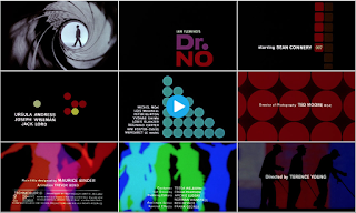
Action/spy film- silhouettes, gun barrel (iconography which establishes the genre). Features Sean Connery-most known for James Bond.


Splice
Sci-fi film, green colour scheme, consistent colour scheme throughout which gives off a skin/ alien effect on the audience.


The back up plan
Chick flick- bright colours. Hybrid: Romantic-Comedy (Rom-Com). Romance iconography- babies on TV. Comedy iconography- Flasher. This film is clearly targeted towards a female audience- elegant typography, animation, colour scheme.


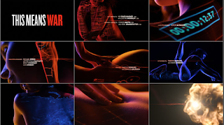
This means war 
Rom-Com: references spy film. Uses intertextuality to reference a James Bond film.

Spy Genre Research

Wednesday, 20 January 2016

Saul Bass- 1960 Psycho title sequence analysis


Saul Bass's title sequence for the original Psycho movie (1960, Alfred Hitchcock) is a good example of the style that he adopted for the majority of his career. The use of straight lines and simple text, accompanied by a dramatic soundtrack encapsulated the genre of the film perfectly.

The genre is horror and the sinister sounding soundtrack conveys this well. The text itself is very simple, something an audience is used to seeing of Saul Bass. The straight lines are used to almost separate each block of text as it appears to almost "push" the text off the screen before disappearing to allow more text to enter the screen. These lines can also be seen to form some of the text itself throughout the sequence. The titles adopt a san-serif style font.

It is also interesting to note how the lines don't all come from the same part of the screen as they appear onto the screen from all angles. It could be argued that the lines are extremely fitting for a horror film as there is no room for flexibility or perhaps even escape. This suits the genre well and perhaps gives the audience an insight into what will happen later on in the film.

The soundtrack is extremely off putting and disturbing which is very effective given the genre of the film. It also suits the way the sequence is designed with all the straight lines as the notes sound very sharp and abrupt, almost like the lines themselves.


Tuesday, 19 January 2016

Class notes- Thursday 14th January

Saul Bass (1920-1996)

Who was he?


  • An American graphic designer who became famous for his work in film.
  • He studied design at Art Students League in Manhattan.
  • Born in New York on May 8th 1920.
He had a very recognisable style which consisted of simple and generic shapes. These were strategically used to convey the genre of the film.

He started his career by designing posters with his ability of being able to capture the mood of a film by using simple images and shapes.

Often, these shapes used were hand drawn by Bass in order to create a more casual appearance. This was also usually accompanied by a sophisticated soundtrack.

Throughout his career he designed over 60 title sequences with his most famous including North by Northwest, Vertigo and Psycho.

He worked alongside Alfred Hitchcock a lot in his career with a good example being Vertigo.

His title sequences revolutionised the style in which we see them these days.