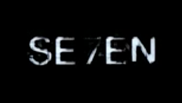
The typography used in David fincher's Se7en (1995) is very irregular, which suits the way each shot coincides with another shot. The footage used constantly overlaps, causing an uneasy and irregular pattern. This is why this font suits the sequence. It also appears shaky and disorientating which also suits this uneasy and uncomfortable style that the sequence adopts.
It is very likely that it could be hand written, allowing the audience to create enigma's over the character in the sequence and whether or not it is his. Going back to one of my earlier points, the way the titles appear on the screen is very shaky and not normal. Perhaps, because this is a horror film, this is implemented to almost represent a heart beat which is beating faster than it should by the thought of something which could be shown in this film.
The text itself is very grainy, and always appears on a black or dark background. It is always coloured white so that it stands out on this background. The way it moves about a lot when it first appears again follows this rhythm that the sequence sets up for itself, with each shot quickly fading or flitting between another shot.

Above is a good example of how the text typically looks. As you can see, the name of the actor/crew member is normally clearer, so that the audience is informed properly. However, the rest seems shaky and distorted.

The title of the film itself appears on the screen several times before it clearly focuses. As you can see, this too is on a black background which emphasises the text so the audience knows where to look.
In terms of the order of the titles, the main actors and crew members come first. The film name comes roughly in the middle followed by the rest of the crew's names.
No comments:
Post a Comment